The last few articles in this series have focused on identifying chop in the market. We started out with an overview, listing several technical analysis indicators that can help in the process, next we focused on the Bollinger Band Squeeze to identify consolidations, and finally we looked at a noise filter to highlight noise, or choppy price action, in the market. In this article we’ll take a look at the ADX (Average Directional Index).
What Is It?
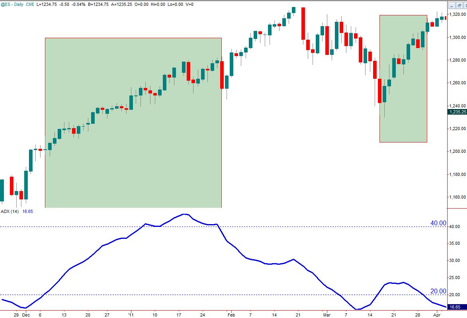
The ADX was developed by Welles Wilder to identify periods of trending price action. The calculations for the indicator are based on changes in consecutive bar highs (+DI) and consecutive lows (-DI). DI stands for Directional Indicator. These values are combined and smoothed to yield the ADX. The exact calculations are too complex for this article, but you can find the details on line. As originally designed by Wilder, the ADX, +DI and –DI were the basis for a full system. All that had to be added was a stop management strategy. The ADX itself however is often used as a standalone filter for trend following systems. Traditionally an ADX value above 20 indicates a trending market. The exact threshold can vary, and some use 21 or 25 instead. Any time that the ADX is above this value we use a trend following strategy, when it’s below we use a fading strategy or stand aside. Note that the ADX itself does not indicate the direction of the trend, it simply tells us that the market is trending, either up or down. What we can say though is that as long as the ADX is rising, the trendiness in the market is increasing, and as the ADX drops the trend is weakening.
What Do We Do With It?
Figure 1 shows the ADX at its simplest. This uses the default smoothing period of 14. Note the highlighted areas where ADX is above 20. You can see that it signals a trend a bit after the price move starts, and also marks the end of the trend only after the market starts to chop. This is because of the smoothing used to create the indicator. Like all the other trend/chop indicators we’ve looked at, the ADX lags price. Because of this you would not use the ADX to set up your trade, but you can definitely use it to filter your setups. In this figure you would take signals from your trend following system during the highlighted periods, whether they are long or short signals, and stand aside otherwise.
A variation of the standard approach uses a separate threshold to indicate the end of the strongly trending period. Traditionally in a strong trend we would stop taking setups when the ADX falls below 40. If the ADX never rises above 40, then you wait until it falls back below 20. Wilder himself uses 25 in his ADX/+DI/-DI strategy. Figure 2 shows this approach, the highlighted area ending once ADX falls below 40. Note that this approach has us missing the rest of the nice move up, but it also avoids the chop at tail end. It does however capture the cleanest portion of the move.
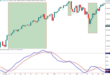
Since a rising ADX indicates a strengthening trend, and a falling ADX a weakening trend, we can reformulate the filter to focus only on the periods where the indicator is rising. A simple technique to use is to add a moving average to the ADX. Figure 3 shows an example using a nine period average of the ADX. Using this approach we would take setups from our trend following system only when the ADX (blue line) is above its moving average (red line). Those areas are highlighted in the chart. Compared to the prior two approaches, this gets us into the trend sooner and has us standing aside sooner. Because the trend can still continue even though it is weakening we will miss out on a portion of the price move however. Furthermore it’s possible to get situations like the middle highlight just because this approach gives more frequent trending/not trending transitions than the earlier ones. You can also plot the difference between the ADX and the average as a histogram for a nice clean look. A positive histogram says you can take setups, a negative one says stand aside.
Remember that the ADX should be used as a filter, not as its own setup. Use it in combination with a trend following system and only take setups when you have ADX confirmation using any of the approaches discussed. A good trend following system should also include a sound stop management strategy, don’t wait for the ADX to tell you to get out of the trade; it will be too late.
What’s Next?
We’re getting close to the end of this series on trending and chop indicators. With what we’ve covered so far you have a set of tools that you can use in combination with your favorite system. Place them all on your chart and do a back test to see which works best for that instrument and time frame. Some of tools may try to accomplish the same thing, for example the Bollinger Band Squeeze and the ADX both have the goal of identifying trending vs. consolidating periods. Other tools may be more complementary, such as the noise filter that attempts to directly measure choppy price action. None of them are the holy grail of trading, and all of them will keep you out of some profitable setups, but they will help you restrict your trading to the most favorable market conditions. So load up your charts and get to work.